

A quick word of introduction. My name is Stuart McDonald and this is Couchfish—the perfect tub of ice-cream for the traveller stranded on the couch. The newsletter has both a paid edition which traces a fantasy itinerary through Southeast Asia, and a free one that covers, well, everything else. You’re reading the latter here—but if you’d like to read the former, you can upgrade your subscription via the button below. Thanks!
Not satisfied by adding up my carbon earlier this year, I’ve been digging more into this stuff—ok, in part to finish a university assignment, but what’s wrong with a bit of multi-purposing? Anyways, I saw a post somewhere that led me to Yet Another Carbon Calculator, and, well, you know the drill, enter your flights, get a “value” and send some of your cash to some mob to do something productive with it ... in theory.
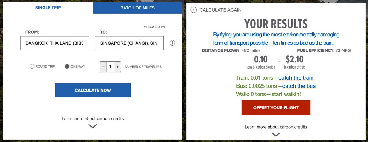
These calculators are pretty variable, but boiled down, they work to dovetail some averages, some math, and a bit of guesswork to give you a number and a price. The screenshot below, from the carbon calculator at Conservation.org, is typical of the experience.

$2.10 … bargain!
I was struck. What is this helping me to do? I mean, other than funnelling some money into Conservation.org to plant trees or whatever, and to act as a salve on my environmental guilty conscience, what is the point?
On their results page it reads:
“Here is the footprint of your flight and how you can neutralize your impact on the climate.”
That’s drawing a pretty long bow if you ask me, but overpromising aside, these results are really kind of “take it or leave it,” they’re not actually helping me reduce my carbon emissions at all. All they’re doing is handing out speeding tickets at the Indy 500.
Making it better
So, how could this be improved? For that I’m going to need to subject you to my graphic design abilities. Perhaps we could start with providing readers with a bit more context—note the figures for train and bus are just for illustrative purposes, walking though is about right.
Oh, I have options?
There’s plenty of OTAs that specialise in transport, in Southeast Asia 12Go and Baolau are two of the more comprehensive—and both have affiliate programmes, thus providing a means for the calculator provider to earn revenue without people getting on a plane. Hell, they could plant even more trees—or hire more consultants, or whatever they do with the money.
The stuff of life
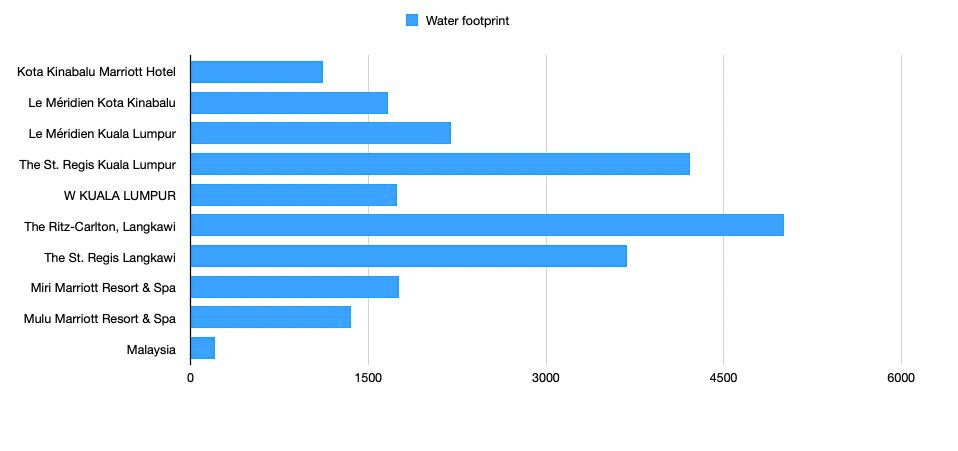
Why stop here though? As I’ve written before, transport—particularly flights—accounts for the majority of emissions, but depending on your style of accommodation, emissions—and particularly water use—pile up fast. Consider the chart below which I tossed up onto LinkedIn the other day, or this piece on water use on Ko Samui in Thailand. My chart compares the water use per room night in a selection of luxurious hotels in Malaysia, then compares it the the HOUSEHOLD average there.
To explain the lines, the average daily household use in Malaysia is 191 litres (source). At the Ritz Carlton Langkawi it comes in at a whopping 5,005.49 litres (source, though just looking now, their reported figure is 5,387.51 litres, I guess someone took a long shower, or perhaps I made a mistake in recording it earlier)—remember, these hotel figures are Per Room, Per Night. I’m writing another piece all about this, so I’m just going to touch on water briefly here.
Shower long and hard like there’s no tomorrow.
So, rather than obsessing solely on carbon emissions from our ghastly flights, if we assume the travelling calculator-user has an interest in their impact, what could we do with the above and, as with transportation, how could we nudge travellers towards less impactful practices? How about something like this?
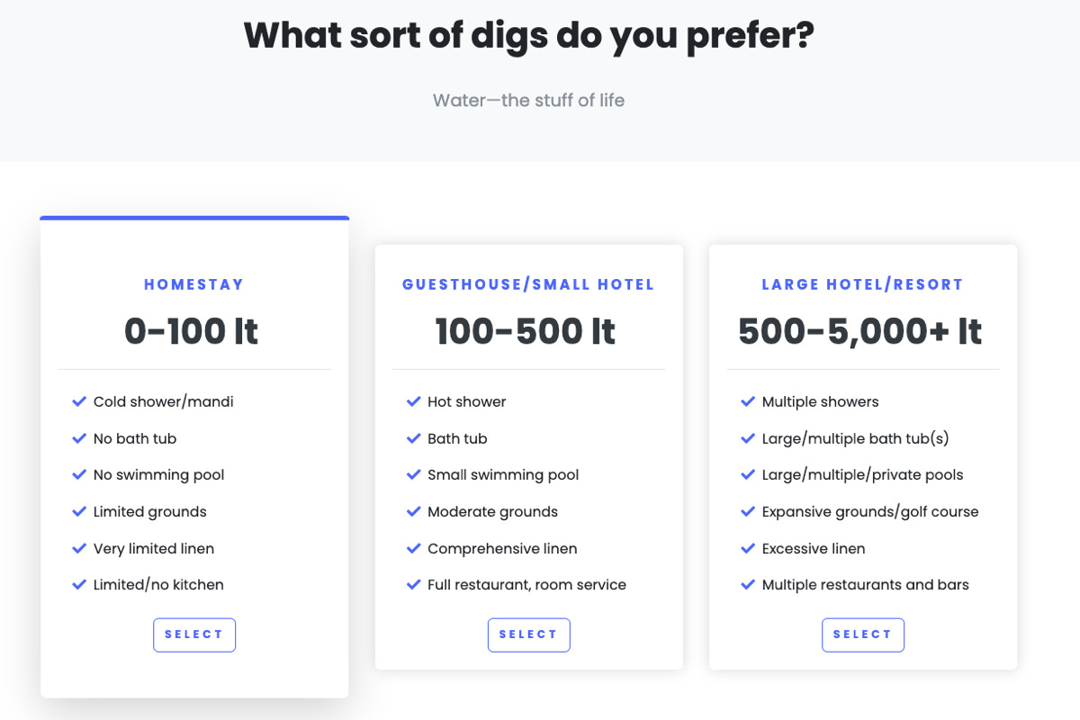
Does brushing your teeth count?
Again, the above numbers (all per room night) are very rough, I’ve got another piece in the pipeline (geddit?) on water use, so take the above as just a rough indicator. Basically, if you’re staying at something like a Ritz Carlton, you’re probably responsible for more water use before you check-in than the backpacker at a homestay uses in a week—insert quip about “smelly backpackers” here I guess.
If you keep the current treatment of flights and emissions in mind, then it is easy to think of a calculator advising something like:
“So your lux resort is going to use a hell of a lot of water, so what you can do is pay us an extra $5, some portion of which will go towards efforts to improve local access to water.”
Better than nothing I guess, but to my mind, you’re better off illustrating in plain English the environmental costs associated with the choices people make, and nudging them towards other perhaps more sustainable options.
Now I’m not for a moment suggesting a Ritz Carlton guest will be penning a five-star TripAdvisor review after their stay at Ketut’s Homestay, but perhaps this sort of nudging could encourage them to, I dunno, rough it at a Sheraton now and then. Likewise the small hotel guest may hit a homestay between horizon pools. Perhaps they’ll even like it.

Just say no to towel torture. Photo: Stuart McDonald.
This sort of thing, soft pushes—informing people rather than billing them—can be very effective. There’s been all sorts of research into this, and I’m barely scratching the surface here. As an example, I liked the last bit of this video that looks at how different messaging towards guests modified their use of water and the towels in hotel rooms. All we need now is some research into towel abuse and why it should be a crime for hotels to twist them into freakin swans.
People power
I’ve written about leakages before, but just to quickly recap, an economic leakage—in the context of tourism—is where a portion of the money you pay for some service or whatever, beats you to the departure gate in heading offshore. Common culprits are inbound tour companies, where anything from 60 to 80% of what you pay to the tour company gets offshored. Claims from tour companies suggesting this isn’t the case should be treated with extreme caution, which is a polite way of saying they are almost always bullshit. Hotels however, are another handy flogging horse on this count, be it through foreign managerial staff, imported booze, technology, or whatever.
With this in mind, the calculator could have another section (don’t worry I’m not going to mock this one up), similar to the water one, showing some typical differences between different styles of properties. I need to emphasise the “typical differences” here, as a homestay can be foreign-owned and -run, just as a luxurious hotel can be locally-owned and -run, but broad strokes, there is a single basic truism at work here:
“The more expensive the price of your room, the higher the probability an increasing proportion of what you pay for your room is not staying in the destination and is instead getting offshored.”
Don’t believe me? This study (while dated) looks at leakages from hotels in Ubud, Bali. The authors found that four- and five-star chain hotels had a leakage rate of 51%, while non-star rated properties (homestays) was under 9%. The biggest source of leakages were F&B followed by staff and management fees.
So what’s the point?
You can’t throw a satay stick without hitting a survey proclaiming that travellers put a high value on the “sustainability” of their travels, and, as I’ve written previously, this term has been so often miss-applied and twisted, that it should come as no surprise that if I was to ask ten travellers what they think sustainability is, I’d get ten different answers.
I mean, who the hell is going to say they prefer to take an unsustainable holiday?
A better calculator however could work to better explain to leisure travellers—in plain English—considerations that are worth, well, considering. Instead of subjecting travellers to some nebulous fee structure in order to keep travelling as they are, instead use the opportunity to nudge them in another, more constructive direction.
Calculators are but one example of a means to nudge travellers. On Travelfish I recently re-ordered most of our destination travel pages—we used to list them with flights up top, then train, bus, ferry and goat. I’ve moved flights to the bottom, so the list now starts with trains (if available). This is a cosmetic change, but it does mean the reader has to scroll past all those other options to finally find out about flights.
Perhaps a few will slow down and consider taking the train instead—and that would be a good thing.
Couchfish is 100 per cent independent and reader-supported. If you’re not already a subscriber, and you’d like to show your support, become a paying subscriber today for just US$7 per month—you can find out more about Couchfish here—or simply share this story with a friend.
Don’t forget, you can find the free podcasts on Apple, Pocket Casts and Spotify as well as right here on Couchfish.


